Hey gang,
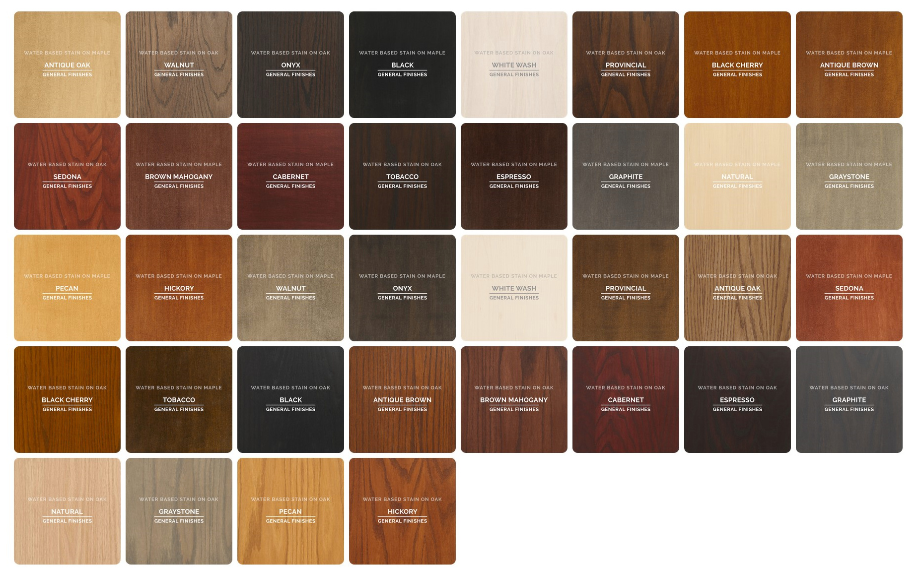
I have some projects on deck where I need to showcase a series of finish options for the end user to pick from, so I figured I would finally take the time to create a multi-material for each wood species I use / brand of stains I usually spec from—for example a maple and white oak multi-material with each General Finishes water based stain:
I’ve been experimenting with some different approaches:
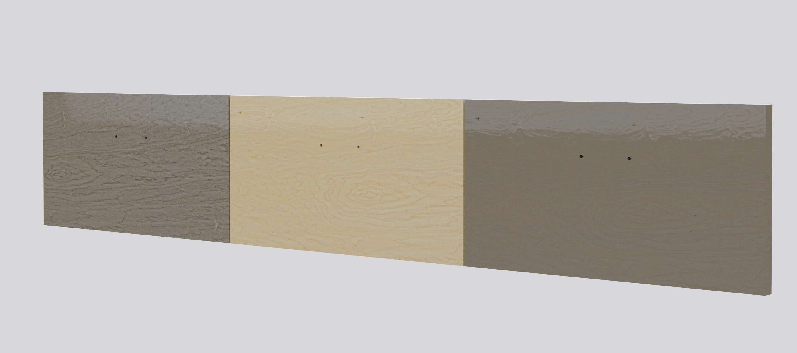
- Center: maple material
- Right: maple material w/ color adjust node low saturation and blend with stain color
- Left: maple material with additional label applied @ 80% opacity—label is maple diffuse image with stain color overlaid in PS using “color” blend mode w/ a bit of curve adjustments
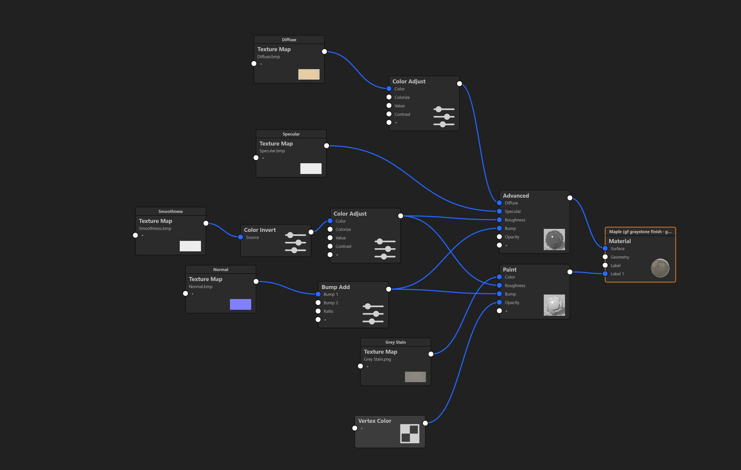
Left material MG:
I’m liking the output of the left approach more, but curious how others would go about this? Any suggestions for achieving a more realistic applied stain look?
Thank you,
M
Hey M,
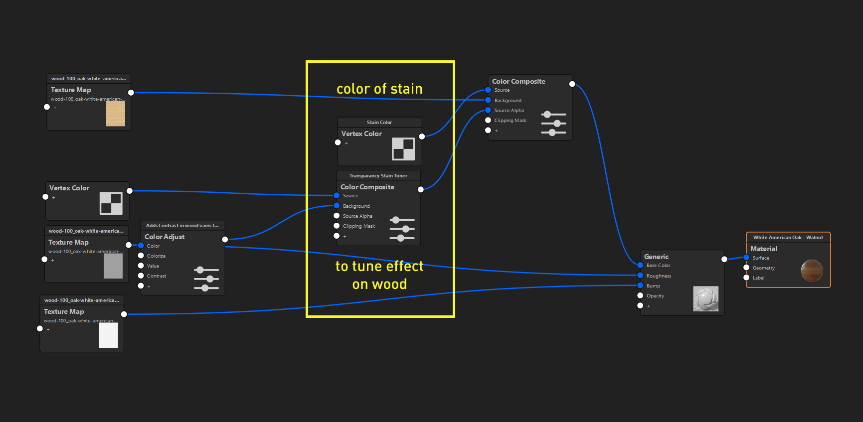
Couldn’t resist to try to make a more simple approach which gives you a lot of flexibility without having to change a lot. Basically you need only two nodes to change (besides the wood, for the different base wood of course).
Basically you’ve the node for the color of the stain and a node to tweak it’s appearance combined with the base wood texture. Basically you can do the ‘photoshop’ kind of things there and depending of the transparancy of the stain, color of the wood you can get the look you want really easily I think.
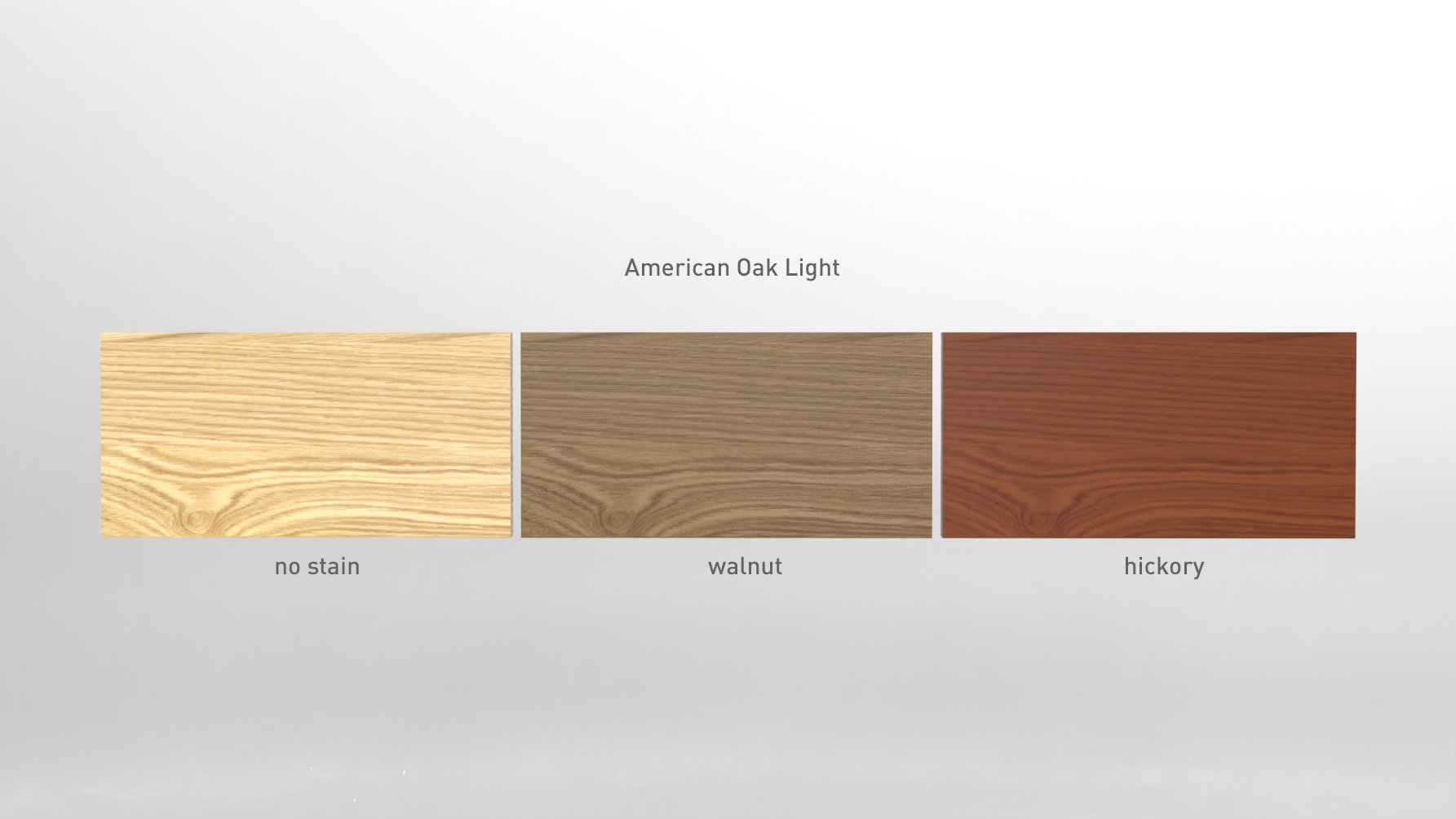
That will give you something like this in my example. For a realistic approach I think it’s important you use the right scale of the wood and good quality of textures. The oak one I used is from Arroway. I’d a bit of a fight with the bump map, even with a terrible low value it’s basically too much but I think you can also just disable the bump if you want a result like the sample sheet you posted. Makes also a bit of a difference if it’s about veneers or real wood with stain I think.
For the light I used a interior but put the saturation on 0. For these kind of things you want as neutral looking light as possible I think but it can be nice to have some kind of reflection, that’s a choice since the sample sheet doesn’t have any.
I’ve uploaded the package here: https://we.tl/t-FEbzko56sI
I’m sure there’s room for improvement but I think this approach will save you a lot of time compared to yours. Let me know if things are unclear!
O
3 Likes
Hey O!
Excellent approach! I need to get in the headspace of aiming to achieve my desired results directly in KS rather than falling back on other software where I’m a bit more comfortable.
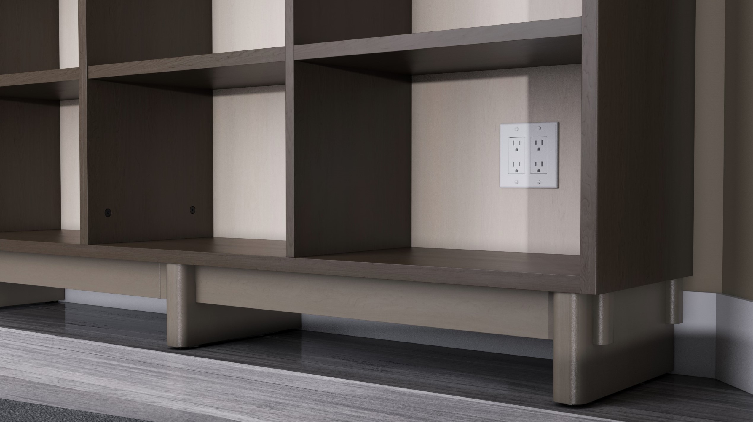
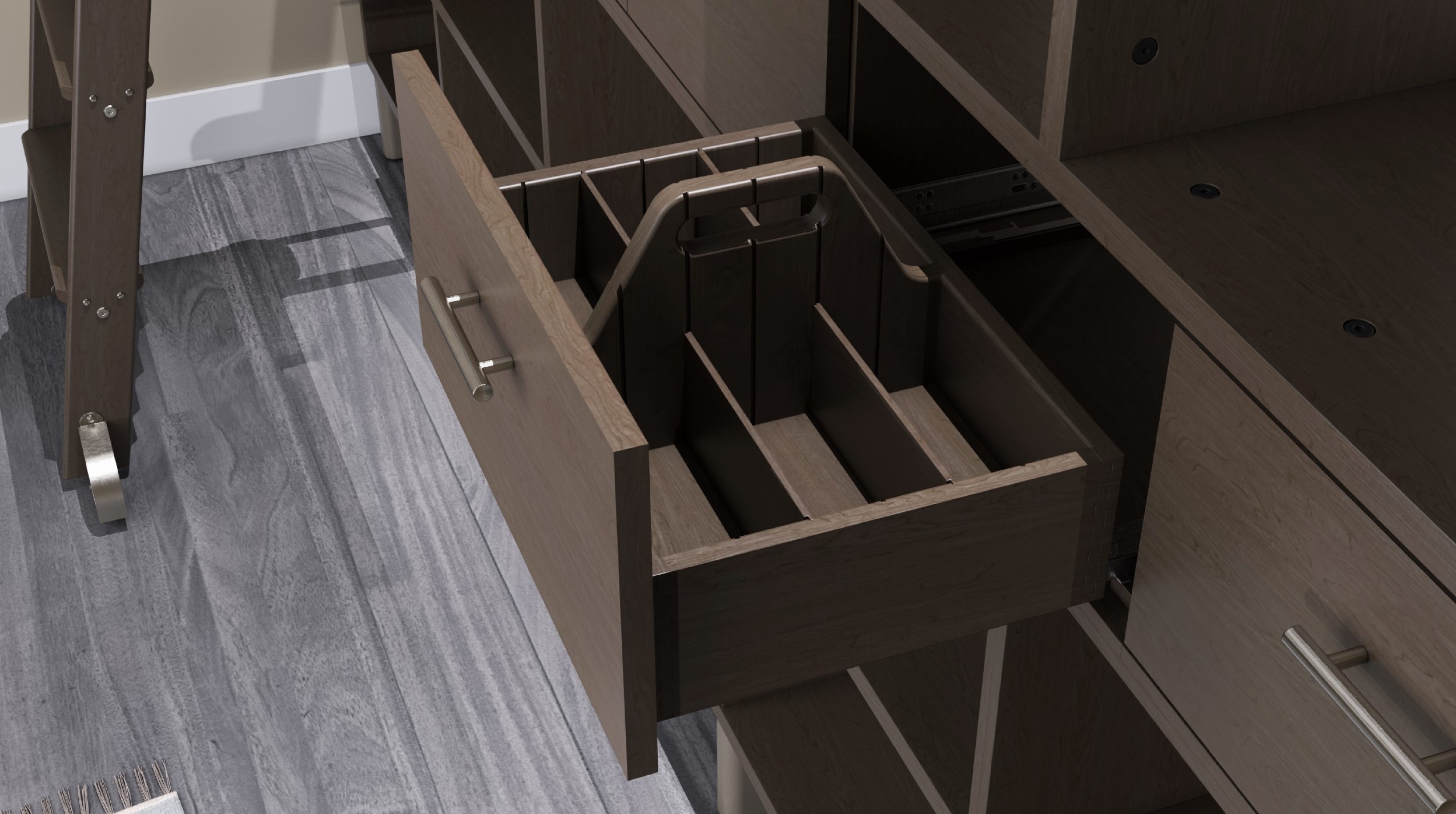
Using the approach you shared, I’ve created a separate paint & stain (the idea being that the paint is a bit ‘thicker’ but still shows a bit of original grain) multi-materials (species of maple in this case) which I used to share a design concept with a client for a custom record shelving project:
Being able to rapidly throw three different finish options onto one model with a few clicks is exactly what I was looking to achieve, so I thank you for your help once again!
Really wanted to work on the lighting for this one more, but have to get the assets out, maybe I can revisit in the future.
Cheers,
M