Would be good to share your results so others can see what your efforts look like at this point.
1 Like
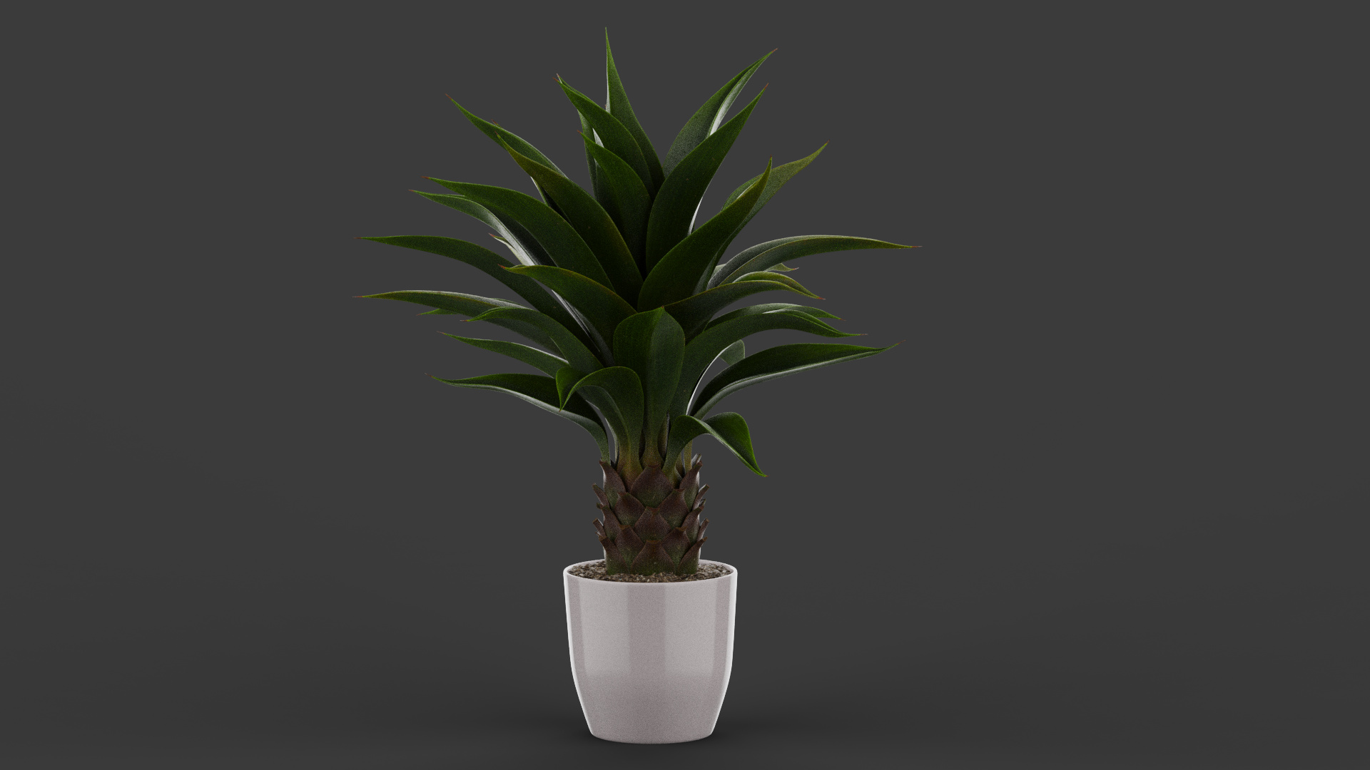
On it! Had to wait a bit until it cooled down a bit in my room.
The bambus of Oscar looks fantastic in my opinion, I think the main difference to the plant is, that the leaves are 3dimensional with a certain thickness to them, while the bambus leaves are mainly 2 sided textures with an alpha channel.
I followed Oscars advice and was able to unlink the vase/pot material from the plant itself, which gave a bit more freedom in terms of applying translucency without the pot becoming see-through aswell.
Here’s where I am at right now:
I’m still trying to make it work in the Translucent medium material.
I tried to follow Oscars advice to apply the texture map in the subsurface aswell as in the translucency node. Which kinda worked.

It gave me this result:


As you can see, there is some sort of subsurface light, but especially in the backlit picture the effect is too strong. Plus it takes alot of time to render (1200 samples for the backlit one, and still alot of noise)
The backlit one looks like glass.
Here is the plant without any translucency:
I will give Olivers advice with the advanced material a go aswell.
1 Like
Hi Lenard,
LOL, had the same with my room, and some online racing in VR felt really disgusting, sweaty hobby.
Must say I do like the result you’re getting. It’s true that the bamboo leaves are like flat and the agave has really thick leaves. I’m actually not sure how an agave looks in real life if you put such really strong lights behind it. It could actually be accurate or not, I’ve no agave here to try.
I think that colour adjust you put after the translucency is a nice one to be able to tweak the result a bit better.
I think SSS-materials are about the most complicated materials for a render engine. At least, in V-Ray for example they also take a long time to render. Do you use CPU or GPU to render?
Not sure what your total render will be but if the plant is in the background a bit I would just use a bit of DOF, saves a lot of render time. But that doesn’t really work if you want the plant to be the main subject of the render.
Hey Oscar!
My master thesis is a modular outdoor kitchen, which will be the main focus of the render itself.
I am adding props to the background to make it more realistic. So this won’t be an important feature.
But it bothered me that the plant didn’t seem to look right in the sunlight.
The main reason why I asked is to understand a subsurface scattering material, why the map exists in the first place and how much control I have over it. It’s more of a learning progress for me really, and to see if maybe I was just missing one little checkbox, which happens quite alot in these programs 
I was rendering on my GPU (GTX1080) for the result above. Is there a rule of thumb when to use CPU instead of GPU rendering?
Hi Lenard,
Sounds cool, be sure to show the final render if you’re able too! I would have the same, for me every project is something I also use to learn new things. And with an outdoor scene with a lot of light it will be way more noticeable if a plant has solid leaves.
I’m a bad one if it’s about explaining subsurface scattering. I get the principle a bit and I understand that skin for example has a different translucency than leaves. Because the translucency color map is actually quite bright green in your material graph I would say that might be the actual colour as well.
Like if you put your finger on a strong flash light you’ll see red because of the blood. So I guess the translucency map of a finger/human would have some red tone, even pretty strong I think. Still, you need a terrible strong light to shine through an entire body and it won’t be a pretty sight.
Well GPU is much faster normally. There are some limits in GPU rendering but not that much within KeyShot. The main issue with GPU is that the amount of VRAM is limited and if you use a lot of heavy textures you can run out which means you’ll have to do it with CPU. The 1080 has 8GB but with different plants using like 4 bitmaps on every kind of leave you can use up quite a lot fast. I always use the headsup-info thing (shortcut h) to keep track of it.
If you think you will need more than the 8GB you can always do some batch file operations you make al bitmaps half the size which means the file size will be around 25% of the original size.
Just saying since it’s a bit stressful if you find out at the end you can’t render with GPU and have to do it by CPU which will really cost a lot more time and I’m sure there’s some deadline looming.
And if you get really stressed, I’m sure some people here don’t mind rendering a few images for you if it’s needed. At least, I wouldn’t mind.
1 Like
To answer you question about the Subsurface Scattering Material, it is a map that defines how light penetrates a translucent surface. Without it, it doesn’t take account light passing through the material, essentially giving it the translucency. If you use a translucent material, it just takes on the standard translucency settings in Keyshot - provided you aren’t using labels which has materials themselves.
1 Like
I suspected something like this, super interesting material!
So is this how the map controls it? Just so I get an idea:
The SSS map lets more light through the lighter the color is, correct? That’s also the reason why on the SSS map both the stones/earth and the pot are blacked out, so no light will be coming through those areas. The color of the map also determines the color that’s shining through.
So adjusting the value of the SSS map with for example a “color adjust” or “color to number” so the overall value becomes darker will reduce the light coming through, or does it only change the color of the light shining through?
If I increase the values I have to make sure not to lighten the black areas, as they will become more and more translucent otherwise.
Sorry if this is alot to ask, but I hope I learned some things about the sss maps.
I think you’re right that the black is black for a reason and means something like it is disabled.

This is the albedo and translucency of a plant I had on my drive. So I think basically it works like you said, both colour makes a difference (saturation) and the luminosity (amount of light passing through).
I’m just not sure if you can just plug the surface scattering image into the translucency or that more things are needed. I do think the colour is that saturated for a reason. That’s also with Olivers images and that part I think is quite ok. Plants act a bit like glow-in-the-dark if you’ve a big light shining though.


These are some pictures I googled. An agave and one with also pretty thick leaves where you clearly see the green almost goes to yellow because of the light passing through.
But like Will I’m curious as well what the result will be, not sure if they have a forum at poligon else you might find some people using their models with KeyShot as well. When I looked through my 3D collection I also saw that some don’t have a translucency map so not sure what they expect you to do, maybe just have it as two sided material.
If I’ve some time next week I’m going to try rendering some thick-leaved plants
1 Like
Your conclusions are correct. You can modify the current SSS file to better suit the results you are in Keyshot. These were most likely created in another 3D modeling software, so they are setup for how that particular software translates the art file. I also find that the Reflection map tied to the Specular map from poliigon - other 3D software translate reflection/specular inverse compared to Keyshot, which is why you often tie in a Color Invert layer and tweek the settings to better suit the specular map. Same with the roughness- since the art file is setup for another 3D software, you often have to tie the color to number node to this and reverse the values to get it to look right.
Here is a youtube video that goes over some of the different maps from Poliigon and how to properly deploy them in Keyshot.
2 Likes
Thanks for that video, had to adjust the bump height to a negative value!
Alright so:
I tried my hands on the advanced material and ran into similar issues like the “Translucent Medium” one. This is the graph, like oliver set up. I just tweaked the value level of the Subsurface texture map with an adjust modifier, so it’s not super bright. 0,65 to be exact.


While it’s letting light through it still looks like a solid glass body when backlit.
I wanted to see where the “Specular Transmission” applies the color, so I changed its hue to a bright pink. This is the result:

While this is an interesting effect, it’s not applying the color where I thought it would apply it.
Towards the thin ends of the leafs there’s no color at all. In the thicker middle parts most of the effect takes place, which leaves me a bit confused.
Oliver, correct me if I’m wrong 
I think you have to think about it a bit different. Imagine the leave is a green transparent cylinder. So the albedo colour is the basic colour the material has, green. The translucency is like the contents of the cylinder with it’s structure, pink.
So it won’t impact the sides a lot since there’s less ‘content’ but more cylinder material. It does start to impact the colour at the centre where there is way more ‘content’ so the colour of it starts to override the actual cylinder colour.
I hope you understand me, basically it’s the ratio between the actual outside and inside which makes which overrides the other. Like with the finger on the flash light. The thicker parts of the finger show way more red than the outer parts of your finger because the ‘blood’ part is way more than the outer shell ‘skin color’.
Okay… Hey Lenard, I hope this is still helpful.
I was planning to send you this file so you could open it up and then I realized I made it in the KS 2023.2 Beta. So, unless you’re running the beta, it won’t open. But if you have it installed, let me know and I’ll send it over.
Lots going on in this thread, but I’ll try to sumamrize my findings:
- KeyShot doesn’t have a shader that will take the Poliigon maps as-is.
- Ideally, you’d use the generic material and the metalness maps, but KS generic shader doens’t support SSS maps

- I found the best results to come from the translucent medium since I could make use of the SSS map plugged into the subsurface parameter, and the color map in the surface parameter.
- I suspect most of the newer maps from poliigon are all linear. I can try to ask them and report back if I find out. Because of this, the results were significantly better when you set the color setting from the default of 1 to 0. This can be found in the ‘color’ accordion in each texture’s properties.
- I find that I get the best results when manually manipulating the roughness and specular maps included with Poliigon assets. This is why I used a C2N node for both of these. And their specualr map was just gray, so I opted to use the gloss (roughness) map.
- I set the translucecy to 10cm. I tested plenty of values, but this produced the right look IMO.
- The lights in the scene are fairly bright. Left light, 20,000 lumen and right light 10,000 lumen and a couple of pins on a black HDRI to toss some light onto the front of the model.
- I used the photographic image style for some bloom and contrast to prevent the highlights from blowing out and the translucency from being too bright. No denoising was used because it cause aliasing issues around the edges of the leaves.
- I renderd in CPU mode to 500 samples and found that if you switch to GPU mode, the translucency is off by a factor of 100. Probably a beta-related bug.
- I increased the contrast and brightness of the color texture a bit to pull some detail out of the color map.
I think that’s it. Sorry for wall of text. This is a somewhat finnecky material to get right and the example image from Poliigon will only be matched under pretty specific lighting conditions.
I hope that helps. Ask if I missed anything.
P.s. Since I found this to be somewhat unintutive, would you be okay if I were to make a tutorial for my YouTube channel about this subject?


4 Likes
Looks nice Will! If Lenard has 2023.1 he can open the 2023.2 file, it does gives a warning about it can be a bit different or not supporting 2023.2 features but loads ok when I tested some.
[edit]
@will.gibbons if you’re going to make a tutorial it might be nice to also cover some other 3D plant suppliers like Globe Plants, Max Tree, Forest Pack and Laubwerk Plants. I think they don’t differ that much in the approach on how to do it but it might give your tutorial a broader audience. I think it’s a nice subject for a tutorial. I can always help you with some example models if you want.
3 Likes
That looks fantastic!
I am honestly not sure which version is used as I am using the educational version of keyshot 2023.
That’s also the reason why I couldn’t really upload my file. First, because you wouldn’t be able to open educational files in a commercial license iirc, second because I don’t know if it’s allowed to send poliigon models around, even though this one is free. Better safe than sorry.
I also had the best results with the translucent medium when I gave it a go yesterday. Used my trick of coloring in the subsurface material to a hot pink, so see the effect in makeshift preview, which looked like this:

and this is one of the better results when the original color was used again:

Just now I used your settings for the most part, and was able to produce this:

Super happy with this, although I have some questions, so YES I would really appreciate a tutorial on this! I think this material is super interesting and versatile and just from this little plant project I learned alot about the materials in keyshot! A more in-depth explanation as to what’s important for such materials would be very appreciated.
I tried to apply your candle tutorial translucency, but as you also mentioned in point 3, there’s no way to control it with a texture map.
Here are some questions I have regarding your step-by-step guide above:
Point 4: What is a linear map, and where can you find the color setting 1, that has to be changed to 0?
I wasn’t able to find this.
Point 6: I was not able to set the translucency to 10cm at all Here is what that looked like with my settings:

I had to change the translucency to 0,05cm to get the better result shown above. Not sure what setting I missed, maybe it’s linked to the color setting mentioned in point 4?
Point 7: I also set up the lights and the way you did, which I believe helped alot with the overall performance. Before that, I tried to only use the HDRI pins for the spotlights, which might not be advisable. Could you, if you do a tutorial explain why using area lights might be better?
Again thank you ALL for the amazing input on this small detail, never thought it would go so much in-depth, super thankful for all the advice I’ve gotten so far.
1 Like
Just a quick reply on point 6, that must be a wrong scaling of the object. If you select the object in your scene and select properties I guess it’s 100x too small or it went from inches to metres. Using the right scale in KeyShot (and other renderers) is quite important to prevent weird render issues and it makes it also easier to work with.
1 Like
Seems alright to me, unless my knowledge of agaves is way off.
It might have to do with the issue that Will mentioned in point 9, now that I think about it.
But I’ll keep the scale check in mind when working in other projects.

Looks perfectly fine indeed!
I forgot to render it in CPU mode. Weird issue.
In GPU mode it looks okay with 0,05cm translucency, in CPU mode that value has to be increased up to 10cm.

I gotta admit that my poor old 4 core/8thread CPU is really reaching its limits now, haha.
Time for an upgrade in the future I hope.
2 Likes
Wonder if that’s a bug or supposed to be that way. I must say that I try to prevent my scenes having to be rendered on CPU since GPU is so much faster. My CPU is a i9-9900K so not that fresh as well but even with a 13900K my GPU will be so much faster it’s just you are limited in textures with the amount of VRAM you have.
Glad you got it figured out.
Right, the translucency value part was point number 9 I noticed. It looks to me to be off by a factor of 100 in GPU mode, which would make sense if the units were meters by default instead of cm… probably a bug.
Answers to your qeustions:
Linear map (too long to explain here, please reference my article here) You can find the contrast slider I mentioned, by entering the material graph, double-clicking a texture (properties on right side of screen) and looking under the Color accordion.
HDRIs are a handy ‘quick’ approximation of light. Physical lights like area lights are going to be more physically accurate. It’s easier to get a sense of how bright or large a light is using physical measurements, as opposed to HDRI values, which are not absolute.
1 Like